Unlike almost anywhere else in the world, ArtCenter College of Design in Pasadena grows from seedlings a bumper crop of the world finest transportation designers. The relatively unpretentious school has been doing this for seven decades. Like the swallows returning to Capistrano each year, the Icons and alumni return to the one of the foremost gathering of motordom.
This year the ArtCenter Car Classic is dubbed 70 years of Iconic Design. AutoDesignO wrangled some of the extraordinary talent to provide some definition to the words “iconic design”, what it takes to create it and examples that ring true to them.
Take five, and bask in the thoughts of a few ACCD alumni, and the judges’ picks for the best of the best in this field of icons!
Interviews and images by John Grafman
_______________________________
- Roger Zrimec – Former Design Studio Manager for Chrysler and Mitsubishi (and a lot of other companies)
Well, to me, my opinion is that iconic design is design that is simple and straightforward. And kind of tells the story about what the car really is. Kind of hate to see some of the stuff that’s out on the road right now because it’s so busy and you can’t tell fronts and backs and there’s lines flying all over the place with no meaning. It’s just sculpture. But when you’re designing a car, you’re designing a whole car. Nice to get the character of the car together and then just keep the design simple, straightforward as to what the base of the car really is.
- Eric Goplen – Creative Director at BMW Designworks
It’s something that’s definitely — for our company; our brand, BMW group — been very important. I think we’ve had a lot of success with that.
The elements that make up the character, the way that it lasts in your mind and in your soul is very important. I think, today, we’re faced with a lot of brand new start-ups. The major dilemma, or challenge, that they’re faced with is creating this new iconism, or the new values that are associated with these new brands. That is something that when you work for a very strong company, is to really hone and craft these icons to make them more recognizable, but also keeping in motion, and keeping the brand alive and changing.
So, creating new icons as we did with the iCars, or emphasizing certain things with motorsport, and then also creating new concepts with emphasis on showing the materials, and showing the technology in the car.
- Frank Saucedo – Director of Advanced Design for General Motors in California
Okay. Well, I’m a Lotus fan and it’s funny you said you were just speaking with Jay (Leno). I know he’s a Lotus fan as well. I love Lotuses. I was a big Porsche fan, still am, for many years, but I bought a ’61 Elite a couple years back and that kind of set me out to end up owning four more Lotuses. I think it’s one of the greatest combinations between engineering and design together. Colin Chapman was a little bit nutty because he built stuff that would race and then fall apart after they finish a race. So, his production cars are much similar to that. They take a lot of effort to own.
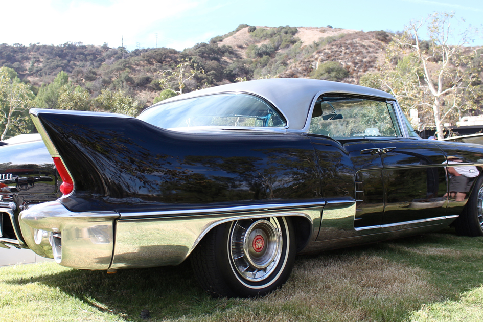
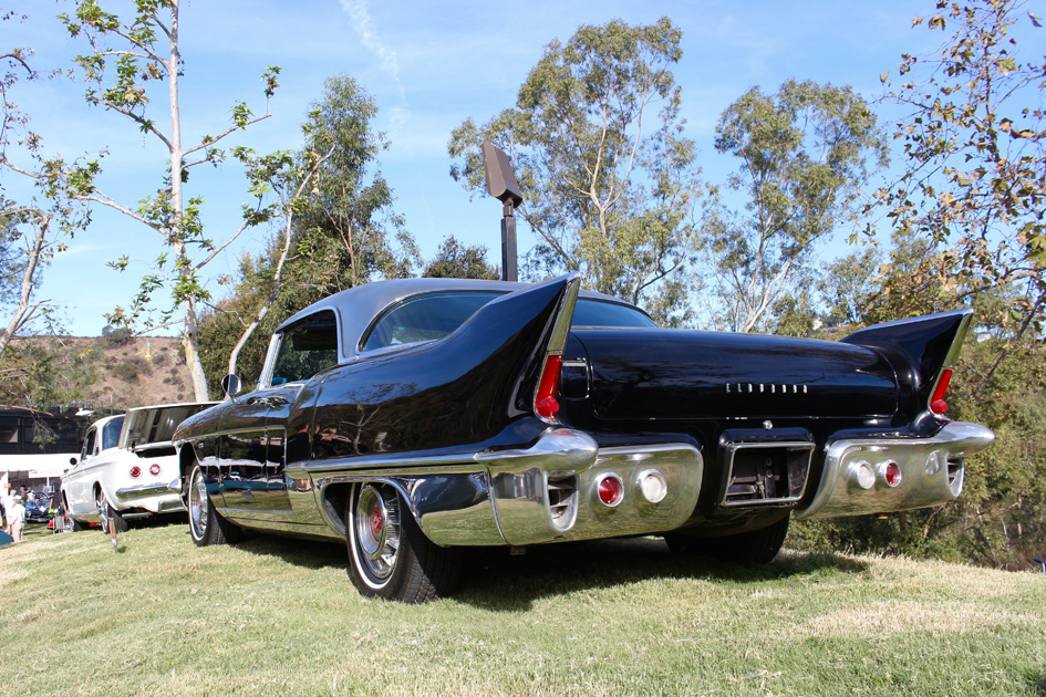
My Elite, which was basically done by his bookkeeper (or accountant) at the time, did a lot of design work on it. And, then Frank Costin came in and made the things aerodynamic. So in ’61 it had a .29 aero coefficiency, which is crazy, but it was still a really pretty car. Classic proportion, long dashed axle, small cabin. So, I like … for me, things that are iconic, like Lotuses, which really kind of merge engineering and design together. We were judging the 50’s postwar cars today, so it was kind of interesting to see something like the Mercedes Gullwing over there next to a Cadillac El Dorado. They both have a place, but I think the El Do was kind of bold, American; they were testing things, the stainless steel roof. Beautiful design, (ArtCenter) alumni Ron Hill designed it. Beautiful car! But then you go see the Gullwing and you kind of go, this is just a piece of engineering wrapped in some beautiful sheet metal.
The other car that was in that class was interesting was the Studebaker because in the same American car in the 50’s, it was so delicate compared to some of the other cars… the Lincolns and the Cadillacs. I think it’s interesting, I think there’s the bandwidth of iconic design is kind of your taste, but I also believe that the things that merge engineering and design together, usually hold the test of time.
- Larry Wood – Former Staff Designer for Hot Wheels (for 50 years and creators of Icons galore)
I obviously had to do the design for the Hot Wheels on all these exotic cars, so, I got to do all the … A lot of these guys specialized in certain things, I had to do them all from Duesenbergs all the way to the 917 Porsche and everything, so, I’m pretty lucky. I really got into a lot of these iconic designs.
ADO: And what did you like? What stands out in your mind as iconic design? Or what makes iconic design?
Well, I’m more of a hot rod custom guy, so, I’ll always like the one off cars that people built and everywhere from a one off Bugatti all the way up to a hot rod where a guy puts a special motor in it or something like that, so, I’m more into the unusual cars, rather than the real design cars.
- Fireball Tim Lawrence – Designer / Entrepreneur
If you look at the design of vehicles, you look at them even unconsciously in three levels. You look at the shape that passes you on the freeway, or a color. And then a secondary level, as you get close, you start to see some of the design details, a little bit of the sculpture, things like that. And then a tertiary element is, you start to see the fine details, like everything from the logos to the cut lines, to the, little Easter eggs that pop up from time to time.
And design language, design philosophy is very much like that. When you walk up and look at a car, you get your first impression of design. If it makes a connection with you, it creates an emotion, and emotional statement. And that emotion could be positive or negative. And that’s the first level. And the second level is when you start to understand the story behind why this car came to be. And the struggle, and the philosophy, and the team that put it together.
Because much like a movie, there are so many people that work on a movie, there are so many infinite ways that a movie can be destroyed, it’s amazing that a good movie comes out at all, right? And when it does, you really have to understand, wow, this team worked well together, and they really understood all the parameters, all the different components, and all the moving parts of this film. And car design is very similar. When you have a strong top-level that makes its way down, as an example, Henrik Fisker, who’s here at the show today with us, he as a very strong design sense, a design language. And he’s able to carry that out and to get people to motivate people to put that together.
But as a design language, those couple of elements, the story, for me, is very important. I learned to appreciate more. As an example, if you go and watch a movie, and you come out and you go, “Oh what a piece of s#@% that was, that was terrible.” But if I went and saw the movie with the director and sat next to him, (first of all, I would never say that, coming out) I would say, “Wow, that’s a lot of work you just did.” But when he told me, “Wow, I had no idea what I had to go through to pull this off. And I was fighting for this, and fighting for that. And this is why this came to be, this is why I shot this at this angle. At the same time I was trying to shoot this thing, I was going through a divorce.” There are all these things that help you to appreciate.
And then at the end of that conversation, you’re suddenly grateful that you got to go see that movie. So that’s very important, that your perception of things determines what it becomes for you. So when you look at a design of a vehicle, instead of judging it harshly and saying, “Oh, that’s terrible, I hate that color.” When you understand why they made those choices, and you appreciate that, then you start to become more grateful and more appreciative of the fact that you get to experience this.
Each one of these cars is a piece of art. You can’t walk up the Mona Lisa and say, “Oh, that sucks.” You can walk up and say, “Well, that’s not really my bag, I wouldn’t put that up in my house.” But I can appreciate all the things that they went through. And plus the story, the story of the Mona Lisa, extraordinary, right? But every one of these cars has that kind of story. And when you appreciate that, you understand that, and then you start to gel on a level to which it was created.
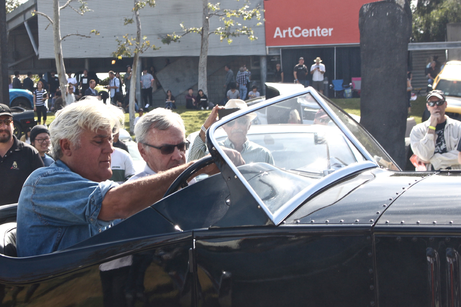
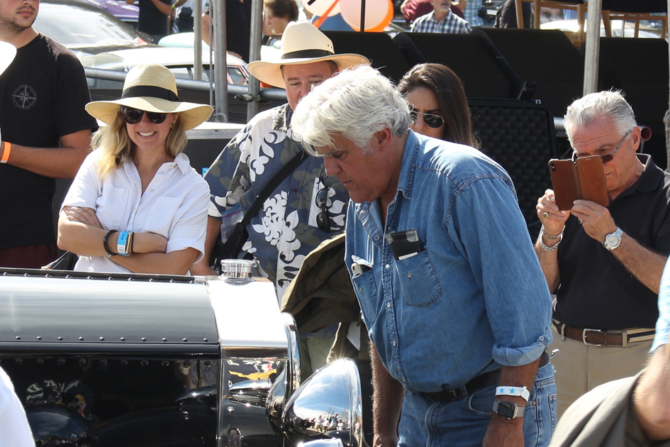
- Jay Leno – Collector of Icons and other cars / Media Mogul
Well, iconic design, I guess, is any design that holds up well over the period of time. I got a ’53 Hudson Hornet, which was state-of-the-art back in the day, then it became old-fashioned, now it looks like a Audi TT; sort of rounded edges, everything. It’s funny how that is. To me, the original design Mustang is iconic because they’ve never built a better-looking Mustang than the original year with the long hood, and the short deck, and all that kinda stuff. It really spurred everybody else to do their version of it. GM, with the big Gran Prix, Pontiac, and all the others.
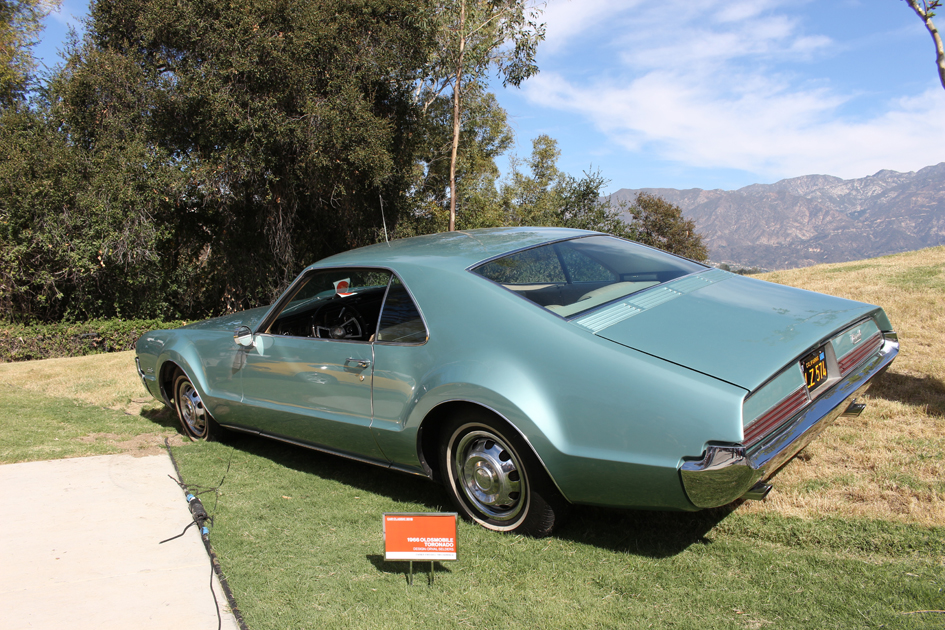
Usually, it’s like a good joke, the first time you tell it, it’s probably the best way. Designers’ first … I mean, the original ’66 Toronado was the best-looking one. Then, oh they put all this jimcrackery on it and a lot of chrome, and it just, it lost its visceral appeal. To me, designers’ first inspiration is always, sort of, the way to go. It’s the cleanest, it’s the purest; and then they always feel they have to change it. I give Dodge credit for keeping that body style for the Challenger for almost, for ten years now because it’s a great-looking car, and they’ve updated the mechanicals and the handling and suspension to make it a real American road car with 707 horsepower. They didn’t have to put a fin on it and change it. Maybe different hood scoop or something of that nature, but iconic-wise, I don’t know how many they’ve sold, but good God.
Miata is an iconic design. The original Miata is still the best-looking one. It’s that almost, it’s hard to almost imagine, with the exception of maybe the Cunningham, there aren’t many cars where the second or third design was better than the first.
____________________________
Icons Of All Shapes And Sizes
… And the awards go to
ArtCenter’s Car Classic 2018 Judges Choices
Post War Classics 1950s
Judges: Geza Loczi, Sue Callaway, Henrik Fisker and Frank Saucedo
Eric Parlee’s 1953 Studebaker Commander Starliner designed by Ron Hill
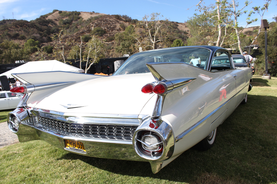
Paul Merrigan’s 1957 Cadillac Eldorado Brougham designed by Ron Hill
Dieter and Patricia Balogh’s 1958 Continental Mark III Convertible designed by Dave Cummins
Post War Classics 1960 through 1964
Judges: Jason Castriota, Marek Djordjevic, John Krsteski, Shiro Nakamura and Jose Wyzsogrod
Jim Powers and Stu Suede’s 1961 Ford Thunderbird Coupe designed by Jim Powers
George Preston’s 1963 Chevrolet Corvette Coupe designed by Peter Brock and Larry Shinoda
Mike Lanska’s 1963 Chevrolet Corvette Coupe designed by Peter Brock and Larry Shinoda
Post War Classics 1965 +
Judges: Joann Jung, Chris Chapman, Jason Hill, Ron Hill and Geoff Wardle
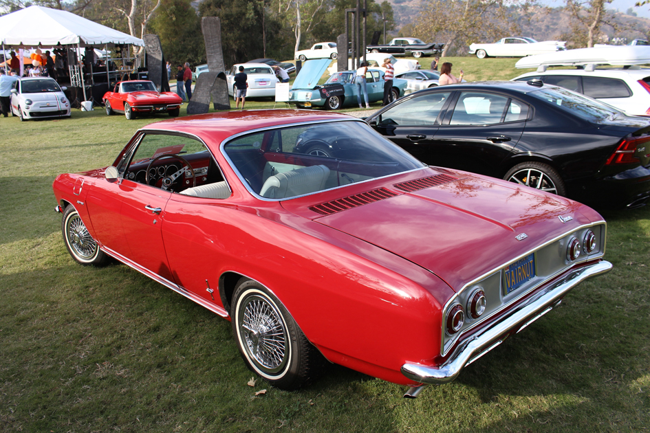
Mike Fiscus’ 1965 Chevrolet Corvair Corsa Coupe designed by Ron Hill and Larry Shinoda
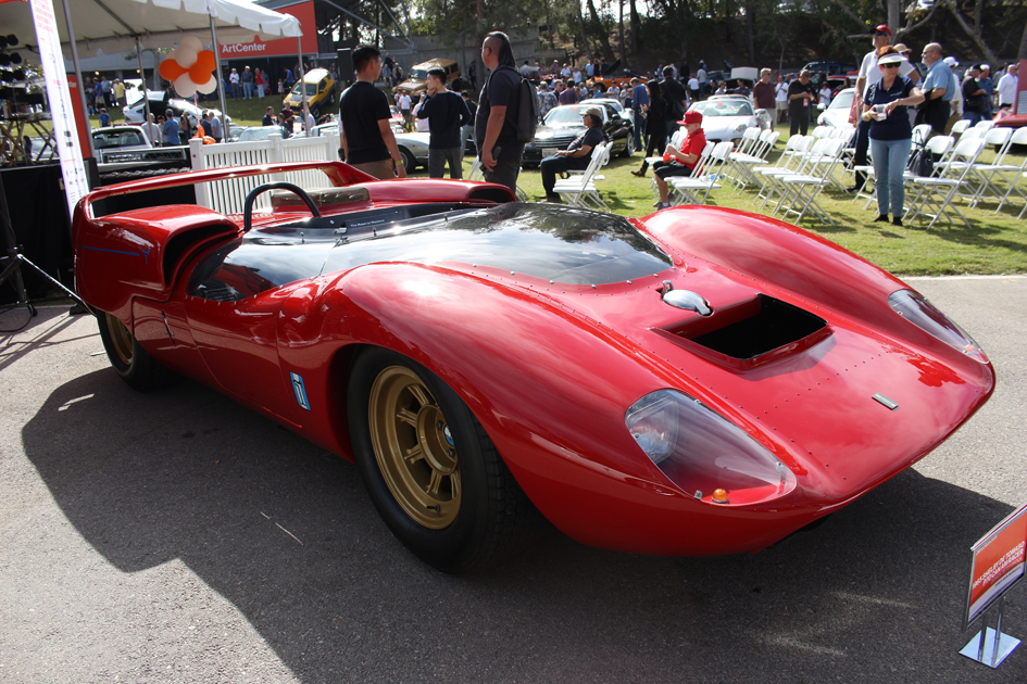
Mark Moshayedi’s 1965 Shelby De Tomaso P70 Can Am Racer designed by Peter Brock
Rosa Farrer’s 1965 Shelby Mustang GT350
Porsche Style
Judges: Fireball Tim Lawrence, Bradley Arnold, Jordan Meadows, Bryan Nesbitt and Franz von Holzhausen
Tim Gregorio’s 1989 Porsche 911 DLS
Hans Lapine’s 1966 Porsche 911
Mark Leonard’s 1959 Porsche 356A Coupe
Exotics
Judges: Sasha Selipanov, Alex Earle, Derek Jenkins, Dave Marek and Daniel Simon
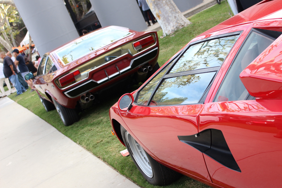
Chuck Gayton’s 1976
Lamborghini Countach LP 400
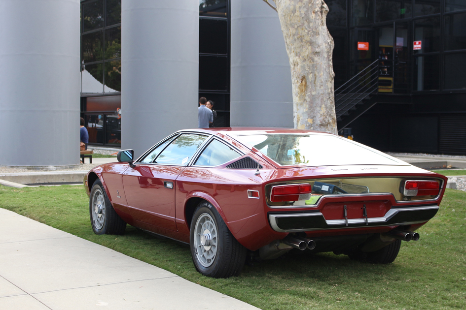
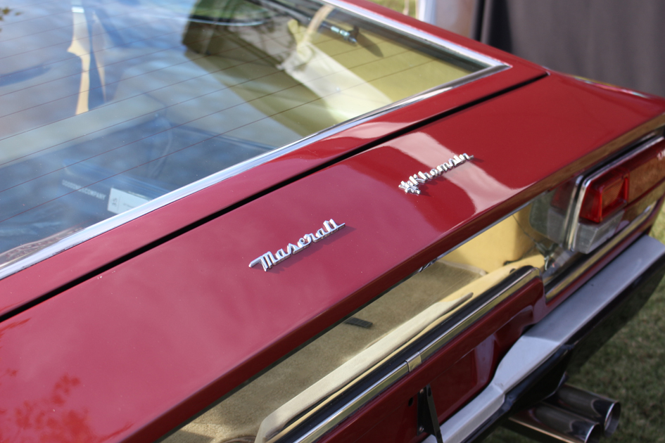
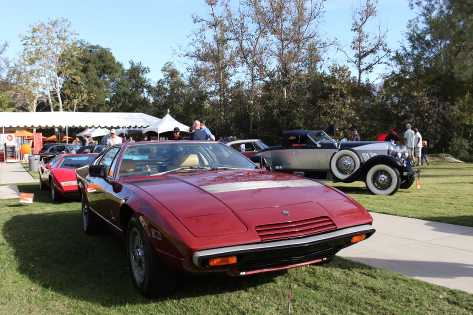
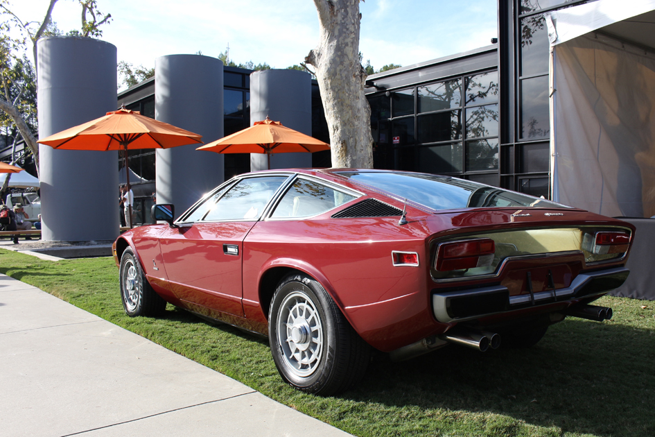
Joe Tseng’s 1977 Maserati Khamsin CP
Pre-War and Motorcycles
Judges: Jonathan Ward, Dennis Campbell, Page Beermann, Jae Min and Rich Plavetich
– Pre-War
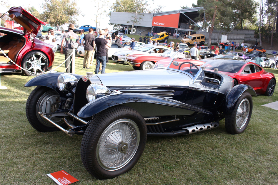
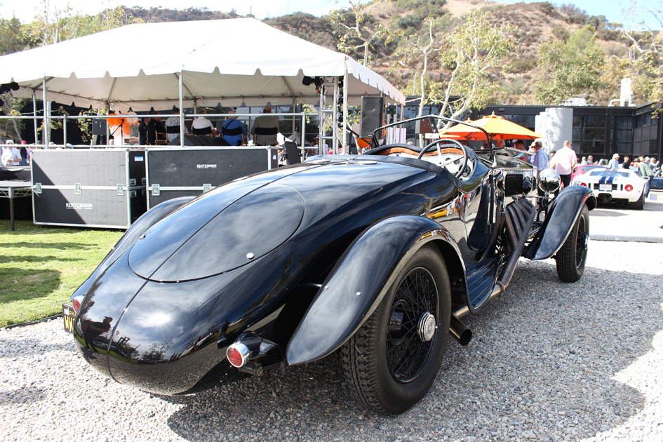
Peter and Merle Mullin’s 1934 Voisin C27 Aerosport
Aaron and Valerie Weiss’ 1929 Auburn 8-120 Boattail Speedster
– Motorcycles
Earle Motors’ 1994 Ducati Monster Tracker
Daily Drivers
Judges: Samuel Chuffart, Kimberly Marte, T. Jon Mayer and Richard Pietruska
Mark Davis’ 1991 Mazda Miata designed by Tom Matano and Mark Jordan
Larry Guzin’s 2000 Audi TT Neiman Marcus Edition designed by Freeman Thomas and J Mays
Satch Carlson’s 2008 BMW Z8 Roadster designed by Henrik Fisker
International Influence
Judges: Chuck Pelly, Sangyup Lee, Kemal Curic, Nubia Krikorian and Mark Moushegian
Brice Reid’s 1972 Volvo 1800ES designed by Jan Wilsgaard
Stewart Reed’s 1990 Toyota Sera designed by Stewart Reed
Homer Reyes’ 1974 BMW 3.0CS
Designer’s Choice Awards
Judges: Stewart Reed and ArtCenter Transporation Design Faculty
Paul Colony’s 1955 Mercedes-Benz 300SL Gullwing
Bruce Meyer’s 1989 RUF CTR
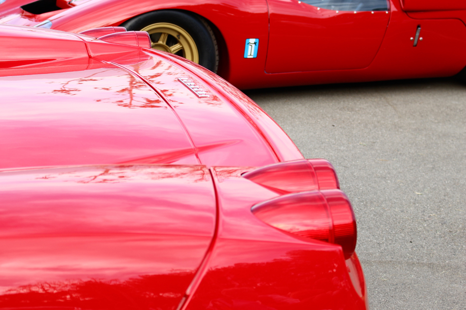
David Lee’s 2003 Ferrari Enzo designed by Ken Okuyama
David Sydorick’s 2012 Alfa Romeo Disco Volante by Touring
Kevin Yi-Chen Chang’s 2004 Porsche Carrera GT designed by Grant Larson and Jason Hill


